
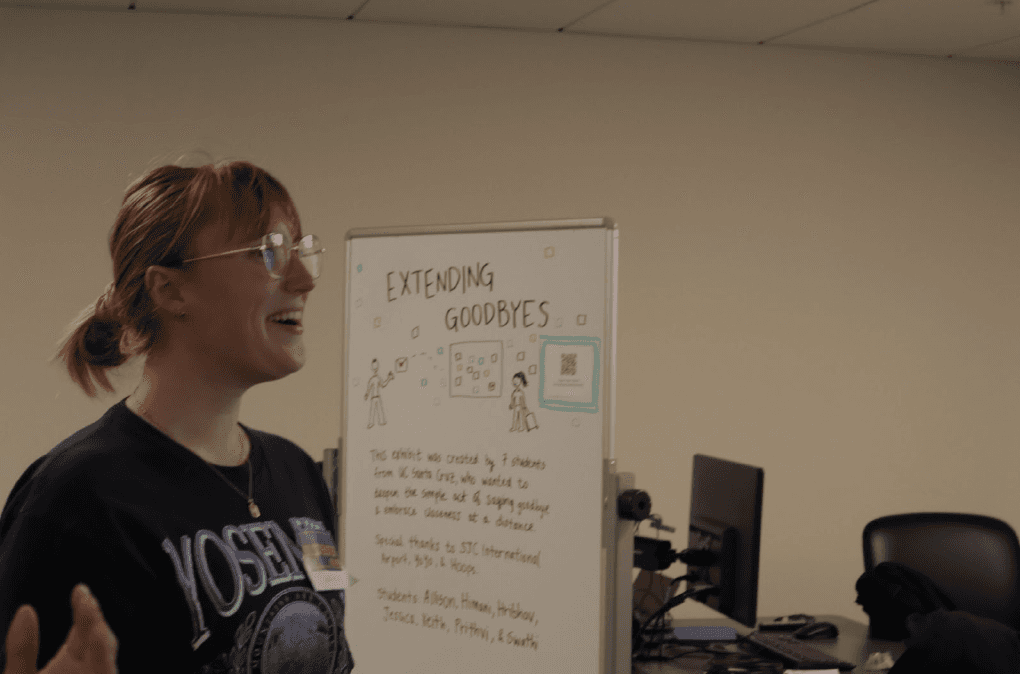
Extending Goodbyes
Extending Goodbyes is an art installation at the San Jose International Airport (SJC) that transforms the airport experience into a reflective and collective space. It is designed to enhance the experience of saying goodbye to loved ones before a flight.
Role
Project Manager, Production Designer
Industry
Immersive Museum Experience
Duration
6 weeks
Context
During my master’s program, I came across a project call in an Advanced Building course: ten pitches, each tackling a different problem space. One immediately stood out—a chance to design an immersive, real-world experience that bridged human-computer interaction and the physical environment.
I knew I wanted to work on something that touched people beyond the screen.
Within a week, I assembled a team of 7. Over the next six weeks, we developed an end-to-end immersive installation for San José International Airport (SJC), aimed at making the departure experience more meaningful—for both travelers and the loved ones saying goodbye.
We identified several key constraints at the outset of this project:
Although designed as an SJC-simulated installation, the showcase would not be physically realized at SJC.
The project showcase will occur regardless of location. So, thoughtful planning is necessary to deliver a polished production and immersive user experience.
Potential resistance from investors and city officials will limit creative freedom; therefore, each phase of the project must strategically account for these anticipated challenges.
The project challenged us to think beyond functionality, designing for emotion, memory, and connection inside a space where goodbyes are often rushed and overlooked, while also navigating the operational constraints of a governmental property.
Problem Searching —> Opportunity Defined
This phase surprisingly took less than a few days to reach agreement.
We began with nothing but a broad problem space: designing an art installation for San José International Airport (SJC). The possibilities—intersecting art, human interaction, digital experiences, and emotional connection—felt overwhelming at first. With a blank canvas and a newly formed team of individuals who had never worked together, I initiated our early discussions on Discord by introducing a reference concept to spark direction and collaboration.
As I hoped, the team quickly began building on the reference, sharing ideas and brainstorming more freely: LED Globe, Kinetic Interactive Wall, Projection Mapping.
After 2 days of open brainstorming, I brought the team together to focus on defining the core design opportunity within our problem space. At the end of that meeting, we had a scope: an interactive drawing and writing board that allowed both travelers and their loved ones to extend their goodbyes.
We approached the project as an opportunity to enhance the physical experience and deepen human connection through design, rather than addressing a traditional problem statement.
Week 1: Site Visit @ SJC
An immersive experience can't be fully effective without first conducting thorough, on-site research. To address this, our team took a research trip to the airport, exploring areas both inside and outside security — particularly the spaces where travelers and their loved ones separate and say their goodbyes.


Post-visit, we have determined 2 locations for the installation to take place.
(Top, Pre-security) Location 1: This open area on the second floor, positioned before the security checkpoint, will serve as the primary space for writing and viewing messages. By utilizing an existing digital board, we minimize additional costs. The elevated location was selected strategically to avoid ground-level congestion and potential disruptions caused by foot traffic near street-level gates.
(Bottom, Post-security) Location 2: This walkway area, situated after the security checkpoint, will allow travelers to view farewell messages as they proceed toward their gates. A new digital board will be installed to support this feature. This site was specifically chosen to provide an engaging visual experience without interfering with TSA operations or causing congestion around the security exit area.
Week 2: Conceptualizing Production + Subteams
Week 2 began as I initiated a team discussion to strategically plan the production details. We began by recognizing the need for two separate rooms in the final showcase—each simulating one of the proposed airport locations. While physically divided, these spaces would remain emotionally connected, mirroring the dual experience of parting and departing at the airport. We carefully considered how to emulate the airport environment, factoring in potential constraints such as privacy policies, user comfort, physical accessibility, emotional atmosphere, and visual cohesion.

Following that, we held an internal meeting to assess each team member’s strengths and skill sets. With a group of 7 spanning both technical and non-technical backgrounds, I organized us into two sub-teams: one focused on production planning, and the other dedicated to technical development. This structure allowed us to work more efficiently, with each sub-team brainstorming the physical components necessary for bringing the installation to life.
Week 3: 1st Prototype Walk-through
Week 3 marked the beginning of initial prototyping—a low-fidelity walk-through of the installation concept. Each sub-team moved into production: the technical team began developing the digital interactions and coding the system’s foundational connections, while the production team focused on mapping out logistical elements and environmental details that would translate effectively in a video prototype.
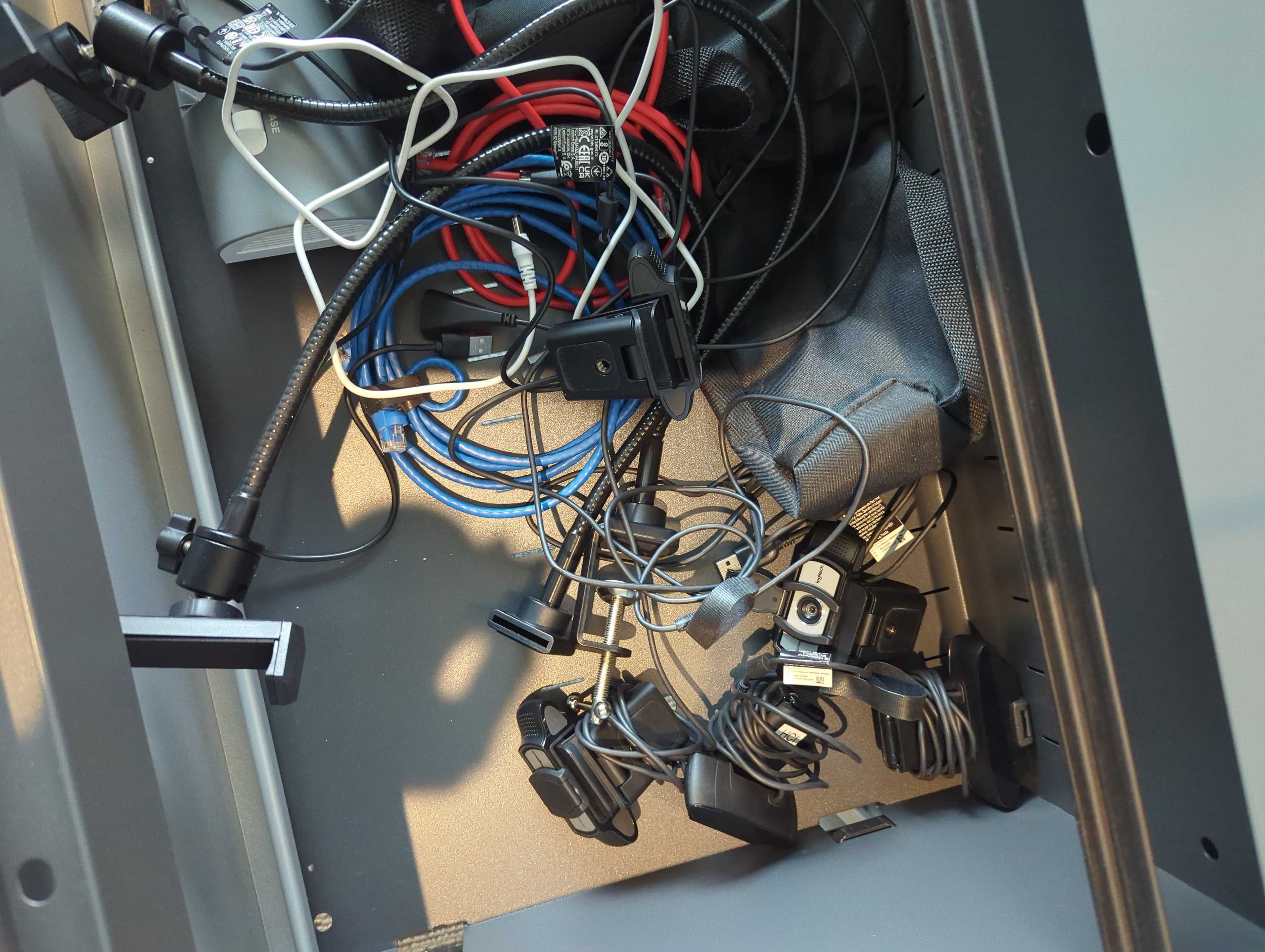
Hardware Installation:
Digital Screens: Installed in a secure area where its content does not compromise airport security [Both Locations].
Webcam & Video Feed: Mounted at Location 2 to capture the terminal travelers while applying a motion blur filter for anonymity and privacy .
Writing Tablet: Positioned directly in front of the digital screen for easy access.
Connectivity: This installation relies on live interactions. Ensure all devices are networked for real-time post-it message updates and video streaming.
Software Configuration:
Video Filtering Application: Connects to the webcam feed, applies motion blur filters, and outputs the processed video.
Message Handling System: Collects user messages from the tablet and displays them in a randomized order on the projector screen as post-it notes.
Integration: Both systems are synchronized via a central control server, ensuring seamless operation.
Week 4: Teamwork, Iterations, Teamwork, Iterations
The following week focused on individual task completion within the two sub-teams, as each member advanced their assigned responsibilities.
The production team (where I was a part of) began refining the logistical details of the traveler’s experience, mapping out the nuances and user flow of the installation. We made the strategic decision to use Post-it's as the delivery theme, emphasizing the brief, meaningful nature of saying goodbye. This choice helped avoid a text-heavy screen that could overwhelm users with information.

Additionally, we began sourcing physical materials to simulate the installation environment, including display surfaces, props, structural components, and decorations in preparation for setting up the full production in the coming weeks.

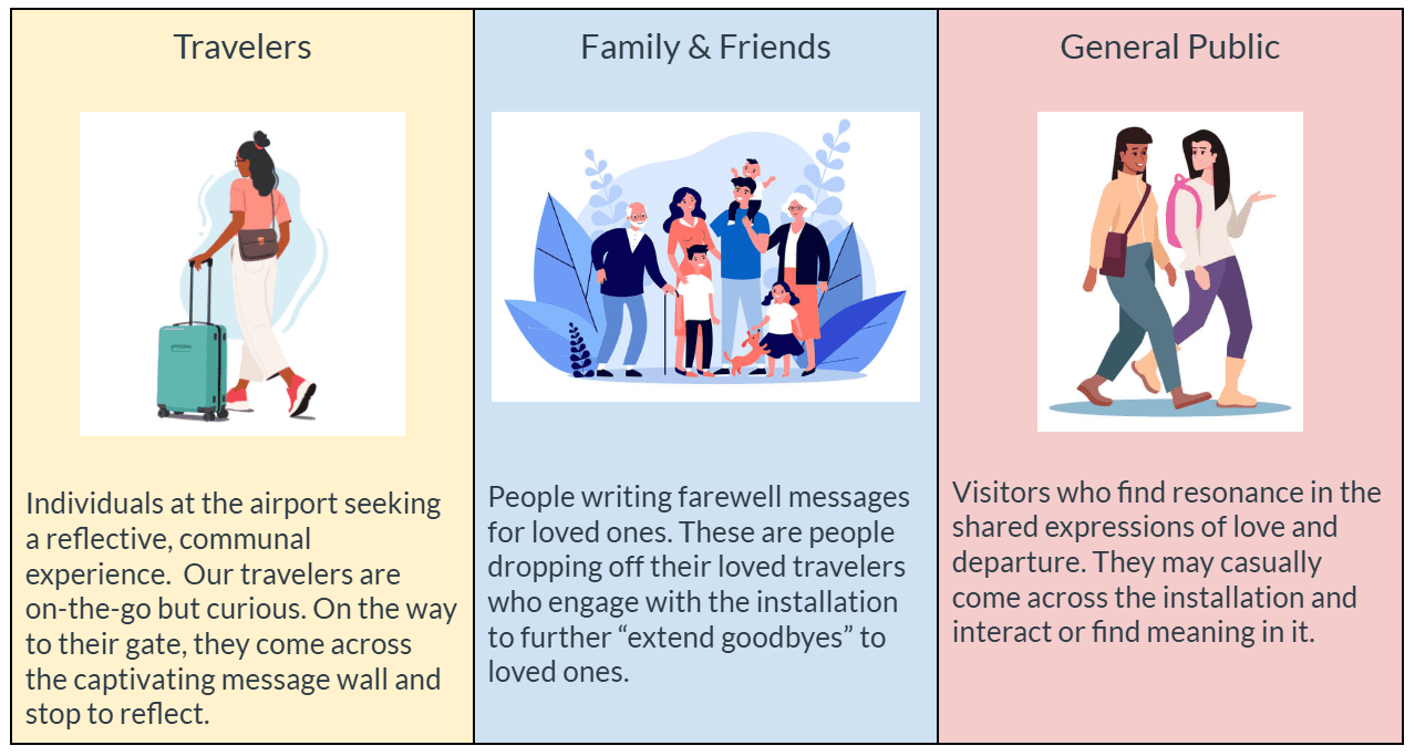
The production team also created a user profile to better understand the needs and behaviors of potential users who would interact with the installation space.
Meanwhile, the technical team concentrated on building out the core interaction: the input and display system, testing message transmission between screens, and ensuring smooth digital functionality.
Display system

Display Preview

Video processing

Server connection
Week 5: Production Prep
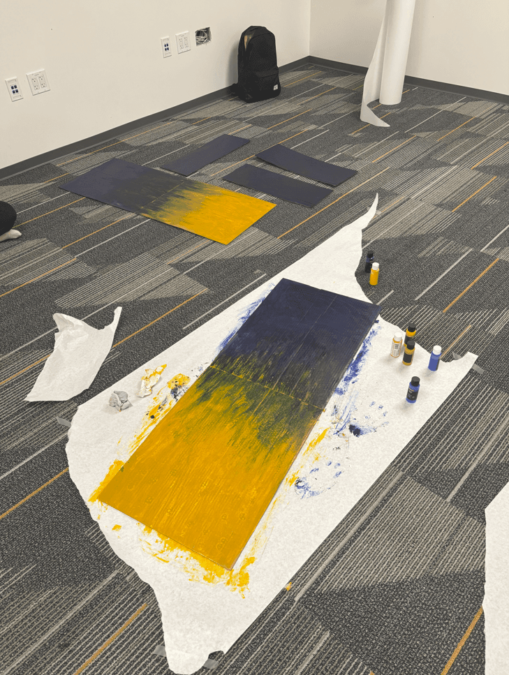
Props to match SJC official colors
"Location 1"

"Tabletop instruction"

"TSA" / "Security"
"On route to Location 2"
"Location 2"

"Location 1 instruction banner"

"Location 2 instruction banner"
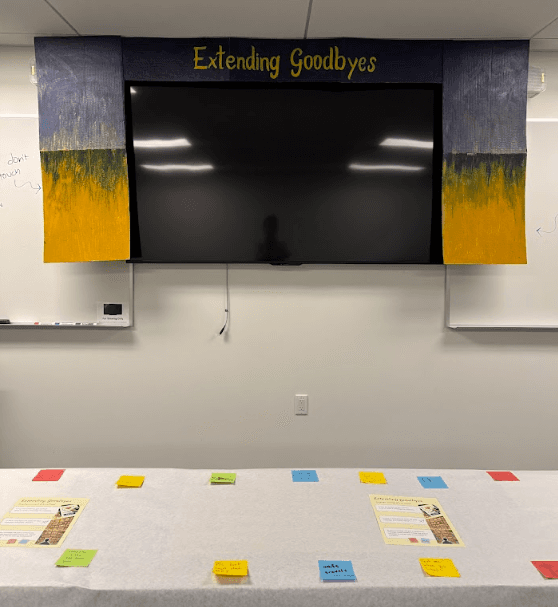
Week 6: Showcase

"Kid's play space next to display tabletop"

"Loved one leaving a farewell message"

"Travelers stopping by to view installation"

"Many loved ones gather to send off traveler"
"Traveler smiles from loved one's message"

"Many goodbye messages form a community"

"Location 2"

"Location 2"
In Retrospect
At the end of the showcase, I led the team through a 30-minute postmortem discussion, where we discussed both the triumphs and areas for improvement, listed below.
What Went Well:
The showcase was well-received, with 40+ visitors in attendance and a 97% satisfaction rate from participants.
The installation ran smoothly for over 3 hours without major technical issues.
Positive feedback on the use of 200+ pieces upcycled materials — especially recycled post-its — aligning with sustainability goals.
The auditory experience, including the server hissing sound, effectively replicated airport ambiance.
The blurred camera effect preserved privacy while adding authenticity to the airport setting.
The consistent use of sticky notes created a cohesive aesthetic and interactive experience.
Engaging infographic and airplane designs enhanced the immersive experience.
What Could Be Improved?
Technical preparedness and system reliability — last-minute device compatibility issues.
Better communication between team members during the event; use of walkie-talkies could have helped.
Visitors were uncertain about interacting with some elements, indicating the need for simpler instructions.
Motion blur filter could be refined for better privacy without distorting the ambiance.
Increased capacity for real-time message updates during peak times, and improved memory management.
More content moderation training to handle higher volumes of incoming messages, with a focus on filtering inappropriate language and ensuring a positive, respectful environment.
Lessons Learned:
Always have a Plan B for technical components prone to issues.
Early user testing, particularly for accessibility features, is essential.
Clear communication channels are crucial between technical and non-technical team members.
Instructions should be simplified, using visual cues or minimal text for better engagement.